FINAL EXAM
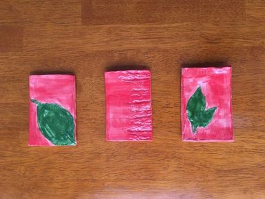
For the 3D piece I chose to use clay. These are three tiles with leaves and bark imprinted on them that I found around the school.
|
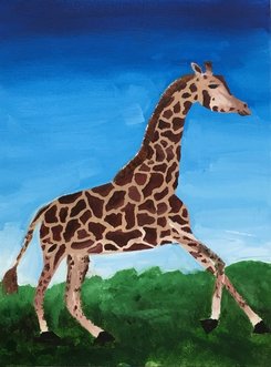
This is my Yes piece. I chose do an oil painting because it is my favorite medium to use. Also, I'm not sure why, but I was very inspired to paint a giraffe.
|
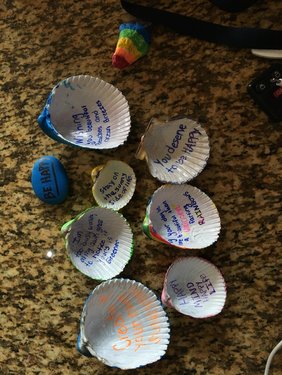
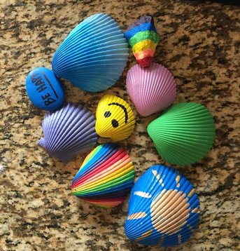
In this image, and in the one to the right, is my Expression piece. Alyssa and I chose to write happy sayings and draw happy things on shells/rocks. We then spread them across down town Apex to spread happy messages and give people a reason to smile.
|
|
Reflection
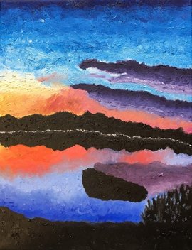
1) The art piece that I am most proud of from Art 3 is my first oil painting of a sky and it's reflection over a lake. I am most proud of this piece because from it I learned that I absolutely love oil painting. I love being able to blend so easily on the canvas and I really enjoy creating texture with oil paint. On this painting I also love the colors that I used. They are very vibrant and pretty. This is also the first piece I have ever done that I am actually proud of. (The image of this piece is in my blog post below).
2)The assignment that was most challenging for me in this class was probably the prisma drawing. For starters, I did not like the way my piece came out. Also, it was very difficult for me to create something that replicated the image I was trying to draw. I know Prisma is suppose to blend easily, but I did not like the way it worked. I think that if I was better at it I would enjoy it more. A lot of people in our class LOVED Prisma and do a really good job with it, so I would say that what I learned from this assignment was that not every medium is for everyone.
3) I think the thing I loved most about Art 3 was the freedom that we had. We were really able to create anything we wanted to as long as it was within the unit we were currently doing. I also love that our class was very small. It allowed me to be myself more and to feel more comfortable sharing my artwork. And along with that I enjoyed our little share circles, it was a great way to get input and advice from peers.
If I could change something about the class it would probably be that I would have liked to spend some time learning how to use clay. I really enjoy clay, but I don't know a lot of the techniques. I think it would have been really cool to learn more about that.
Painting Unit
I learned many skill/techniques during the painting unit. Before now I had never done an oil painting before, so basically everything I did during this unit was new to me. The biggest thing that I learned was blending on the canvas. Because oil paint take so much time to dry you can blend as you go. I applied this skill throughout my sunset in the sky and the reflection of it in the water. I also used very thick paint in my piece in order to add texture. I did this throughout the whole painting, but did it differently in the water, as opposed to the sky, to make them look different.
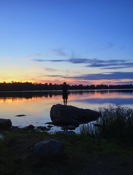
For my painting, I replicated a photo that I took last summer at the lake near the cabin we have in the Pocono Mountains in Pennsylvania. Earlier in the unit we painted sunsets with acrylics, so that helped me to create my own. I also did a mini painting beforehand with oil for practice my techniques. For the first time I actually did not hate my work during the process. I enjoyed the fact that the oil paint take so long to dry because I could blend colors throughout my painting on completely different days. I, also, for once was finally happy with the way one of my finished projects came out. Because of my happiness towards the result of my piece I would definitely consider it successful. I love the colors, the texture, and the way it closely resembles my original image in a different way. |
|
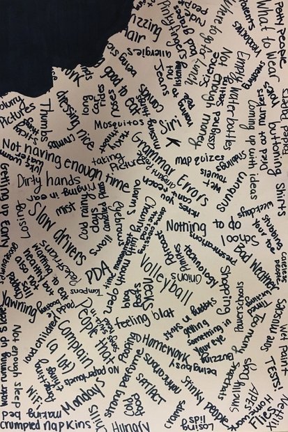
Complaint
Expressive Figure Project
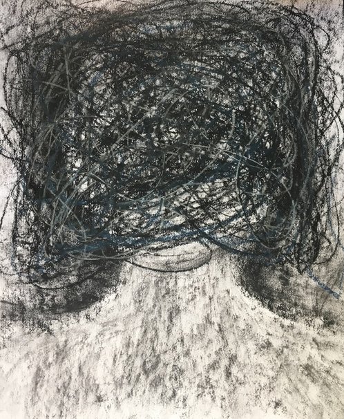
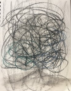
The skills and techniques that I demonstrated in this project were my use of lines as well as my use of contrast between light and dark. The lines that I used in this piece were to depict the constant nagging of obsessive thoughts and absolute craziness of it. The use of contrast was used in the different shades of black/grey. There is a shape of a person's head in a very light color behind all of the scribbled lines outlines in a very dark black.
It took me a while to come up with a idea for this project, but I knew I wanted it to be something that I connect to. I personally struggle with the constant nagging of obsessive thoughts stuck in my head, and I thought it would be cool to express this in a piece of art. The crazy, dark scribbled lines are meant to represent those evil thoughts that consume my mind. I actually ended up redoing the project because I got a little too dark and lost the image. It was a quick project for me though so i was able to get it done again, but better. I even added dark blue lines of chalk pastel to make it less black.
The things I like most about my piece are what it represents, and it's simplicity. I think it is very simple and just stands for what it is.
Prisma Texture
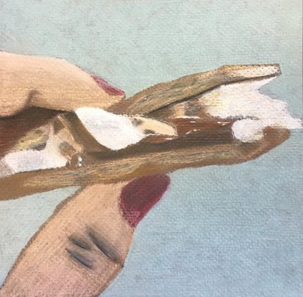
For the Prisma Texture project I chose to draw a hand holding a s'more. This is a replication of a photo I took this past summer.
1) The texture that I had to create in this drawing included the skin of the fingers, the melting marshmallow and chocolate, and the graham cracker, which was the most difficult texture for me to do. I used many techniques to complete this project. For example, I used shadows and highlights. I also used scumbling for the background, marshmallow, and the chocolate. For the graham cracker I used directional lines to get all of the details.
2)There were quite a few challenges and difficulties that I had to overcome throughout this project. For starters, this was my first time using prisma, so I had to get used to that. I did end up enjoying it, though. Also the texture of the paper that I chose to use was very bumpy, which made it difficult to cover up all of the space. I was able to accomplish it though. My biggest challenge was the graham cracker. It had so many details with the holes and shadows making it difficult for me to replicate. One thing that I told myself at the start of this project was that I was going to try to be more positive about how it was turning out. I made sure to remind myself that the was it looked in progress was not how it was going to turn out in the end.
Trite Symbol
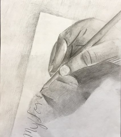
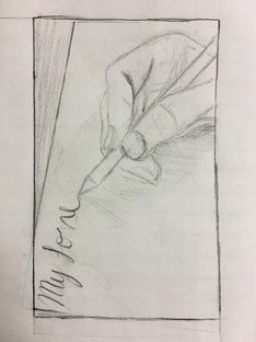
I chose to use a heart as my trite symbol which is usually a representation of love. There are so many things that people to do show their love for somebody like holding hands, or buying flowers or chocolates. I wanted to do something a little more unique, though, to represent love or the heart symbol, so I chose to draw somebody writing a love letter.
I thought I chose a pretty unique composition for this project. The words aren't written horizontally across the page and the hand is at the top of the page where some might choose to draw it at the bottom as if it was the way they saw it when writing on their own piece of paper. I also think the shadows I chose to apply to the drawing made it look more realistic, especially with the sheet of paper because it doesn't just make it look like it is flat on the table.
I thought I chose a pretty unique composition for this project. The words aren't written horizontally across the page and the hand is at the top of the page where some might choose to draw it at the bottom as if it was the way they saw it when writing on their own piece of paper. I also think the shadows I chose to apply to the drawing made it look more realistic, especially with the sheet of paper because it doesn't just make it look like it is flat on the table.
