We Collaborate:
I didn't really do very much collaboration with the idea, color, or just the piece in general. What I did get some help with, but clearly not enough, was just having someone hold everything still and helping me lying down the stamp this way it would come out more lined up. As I was doing the first few prints it was actually pretty lined up, but when I stopped getting help and got to the last couple of prints everything got messed up. I did find it easiest, though, in the beginning to line up the stamp and the print by having the stamp face up on the table and then attempting to align it by laying the paper on top of it. Towards the end it was easier to have the paper face up and then to align the print on top of the other. I clearly should have continued to use help with aligning the stamp and the print through the whole project though.
I Solve Problems:
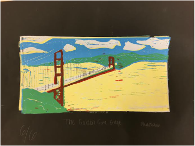
Well...I had a major issue. I accidentally carved out the blue parts when I was supposed to be carving out the yellow parts. I sort of resolved this problem by just changing the color of the sky to blue and the color of the ocean to yellow (it was supposed to be the other way around). When I thought of this I still wasn't pleased, but it really was my only other option. I actually kind of felt like a blue sky and yellow ocean could possibly look cool and could possibly even be realistic. But then after doing it I realized that it would only look cool in a really edited, unique photo. So I did solve my problem, it just didn't look the way I wanted or good...at all.
I Communicate Through My Work:
I have a ton of issues with this piece of artwork. Unfortunately, this was my best one, and it is absolutely horrible. My first, and biggest, issue is that I intended on the sky being yellow and the ocean being blue (plus I hate both of the shades of these colors for the print), but, god only knows where my head was at the time, for some reason I messed up and accidentally cut out what was supposed to be blue when I was supposed to be cutting out yellow. As scary as it is, this was the only one of the six that was even close to being completely lined up, which was the part I liked the least because I had many details on the bridge. And then lastly, even though I am positive that there are more issues with this ugly piece of art, there are a bunch of random lines fall over it that are not supposed to be there. There were a couple that did not have as many ugly lines, but this one looked better overall because it was lined up more and the colors showed better. I was actually one of my most anticipated projects and i was super exited about it. My expectations when I came up with the idea and drew the draft were sky high and then well you can see what happened.
I didn't really do very much collaboration with the idea, color, or just the piece in general. What I did get some help with, but clearly not enough, was just having someone hold everything still and helping me lying down the stamp this way it would come out more lined up. As I was doing the first few prints it was actually pretty lined up, but when I stopped getting help and got to the last couple of prints everything got messed up. I did find it easiest, though, in the beginning to line up the stamp and the print by having the stamp face up on the table and then attempting to align it by laying the paper on top of it. Towards the end it was easier to have the paper face up and then to align the print on top of the other. I clearly should have continued to use help with aligning the stamp and the print through the whole project though.
I Solve Problems:
Well...I had a major issue. I accidentally carved out the blue parts when I was supposed to be carving out the yellow parts. I sort of resolved this problem by just changing the color of the sky to blue and the color of the ocean to yellow (it was supposed to be the other way around). When I thought of this I still wasn't pleased, but it really was my only other option. I actually kind of felt like a blue sky and yellow ocean could possibly look cool and could possibly even be realistic. But then after doing it I realized that it would only look cool in a really edited, unique photo. So I did solve my problem, it just didn't look the way I wanted or good...at all.
I Communicate Through My Work:
I have a ton of issues with this piece of artwork. Unfortunately, this was my best one, and it is absolutely horrible. My first, and biggest, issue is that I intended on the sky being yellow and the ocean being blue (plus I hate both of the shades of these colors for the print), but, god only knows where my head was at the time, for some reason I messed up and accidentally cut out what was supposed to be blue when I was supposed to be cutting out yellow. As scary as it is, this was the only one of the six that was even close to being completely lined up, which was the part I liked the least because I had many details on the bridge. And then lastly, even though I am positive that there are more issues with this ugly piece of art, there are a bunch of random lines fall over it that are not supposed to be there. There were a couple that did not have as many ugly lines, but this one looked better overall because it was lined up more and the colors showed better. I was actually one of my most anticipated projects and i was super exited about it. My expectations when I came up with the idea and drew the draft were sky high and then well you can see what happened.
 RSS Feed
